
Pinterest Predicts 2026: What’s coming next and how it could shape what you create

Every year, Pinterest releases its Predicts report and every year people say the same thing: “This feels a bit bonkers.” I know I certainly do! And every year, Pinterest quietly proves us wrong.
Pinterest Predicts isn’t guesswork. It’s built on real search behaviour from people planning their lives, their homes, their wardrobes and their businesses. Which means if Pinterest is predicting it, there’s a strong chance your future customers are already circling it.
This is not a playbook. It’s not a checklist. It’s a creative nudge. Think inspiration, not instruction. Pick what fits. Ignore the rest. Have fun with it.
Let me introduce you to the key Pinterest Predicts 2026 trends and how I think small business owners can use them visually and creatively.
Cool Blue
Calm, clarity and quiet confidence
Cool Blue is exactly what it sounds like. Soft, airy, calming blue tones showing up across fashion, interiors, beauty and lifestyle.
Theme and style:
Fresh, spacious, serene, unfussy
Colour feel:
Powder blue, sky blue, icy tones, soft greys
How this could show up in what you offer:
– Interior designers using cool blue as a grounding wall colour or accent
– Makers creating ceramics, glassware or textiles in soft blue palettes
– Wellness brands leaning into calm, breath and stillness
– Fashion or accessories featuring blue as a neutral rather than a statement
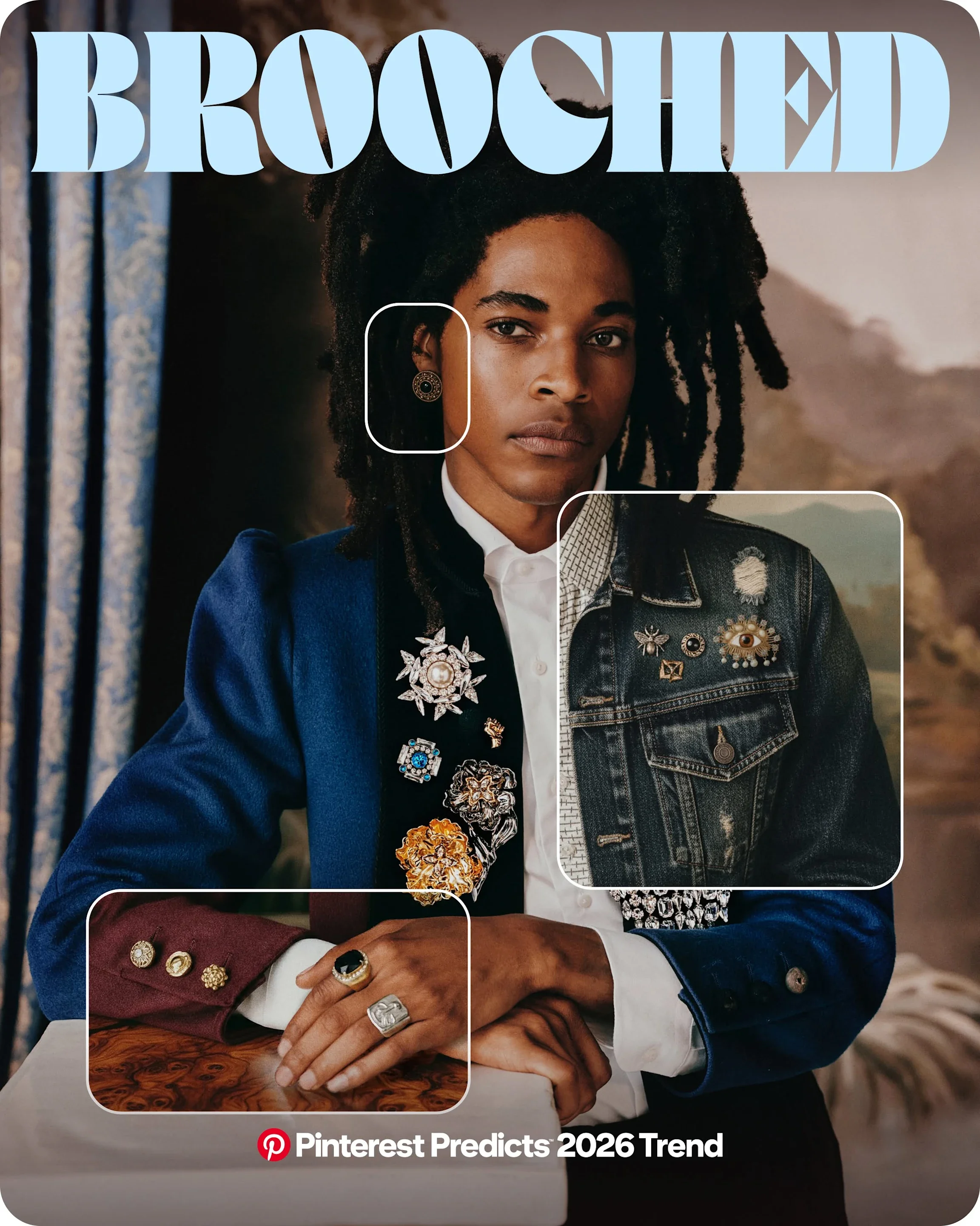
Brooched
Adornment with meaning
Brooches are back. Not dusty, not formal. Personal, expressive and often sentimental.
Theme and style:
Vintage, heirloom, personal storytelling
Colour feel:
Antique golds, pearls, deep jewel tones
How this could show up in what you offer:
– Jewellery brands designing modern brooches or pins
– Fashion brands using brooches as styling pieces rather than accessories
– Makers creating wearable art or keepsake pieces
– Craft businesses offering workshops or kits around personal adornment
Opera Aesthetic
Drama, glamour and emotional impact
Think velvet curtains, candlelight, old theatres and expressive silhouettes.
Theme and style:
Theatrical, romantic, elevated
Colour feel:
Burgundy, black, gold, cream, deep plum
How this could show up in what you offer:
– Event stylists creating immersive, dramatic settings
– Fashion brands leaning into statement silhouettes
– Interior designers using rich fabrics and bold lighting
– Experience based businesses creating moments that feel special and decadent.

Extra Celestial
Cosmic, magical, otherworldly
This trend leans into stars, planets, iridescence and a sense of wonder.
Theme and style:
Dreamy, mystical, futuristic
Colour feel:
Midnight blue, silver, opalescent finishes, cosmic purples
How this could show up in what you offer:
– Jewellery inspired by stars and moons
– Beauty products with shimmer or iridescent finishes
– Home décor featuring celestial motifs
– Creative services exploring spirituality, astrology or intuition
Fun Haus
Playful interiors and joyful design
Bold shapes, colour and humour enter the home.
Theme and style:
Playful, graphic, confident
Colour feel:
Primary colours, bold contrasts, statement shades
How this could show up in what you offer:
– Homeware brands creating sculptural or quirky pieces
– Cafés or studios designing fun, personality led spaces
– Makers embracing bold pattern and form
– Creative brands giving themselves permission to be joyful
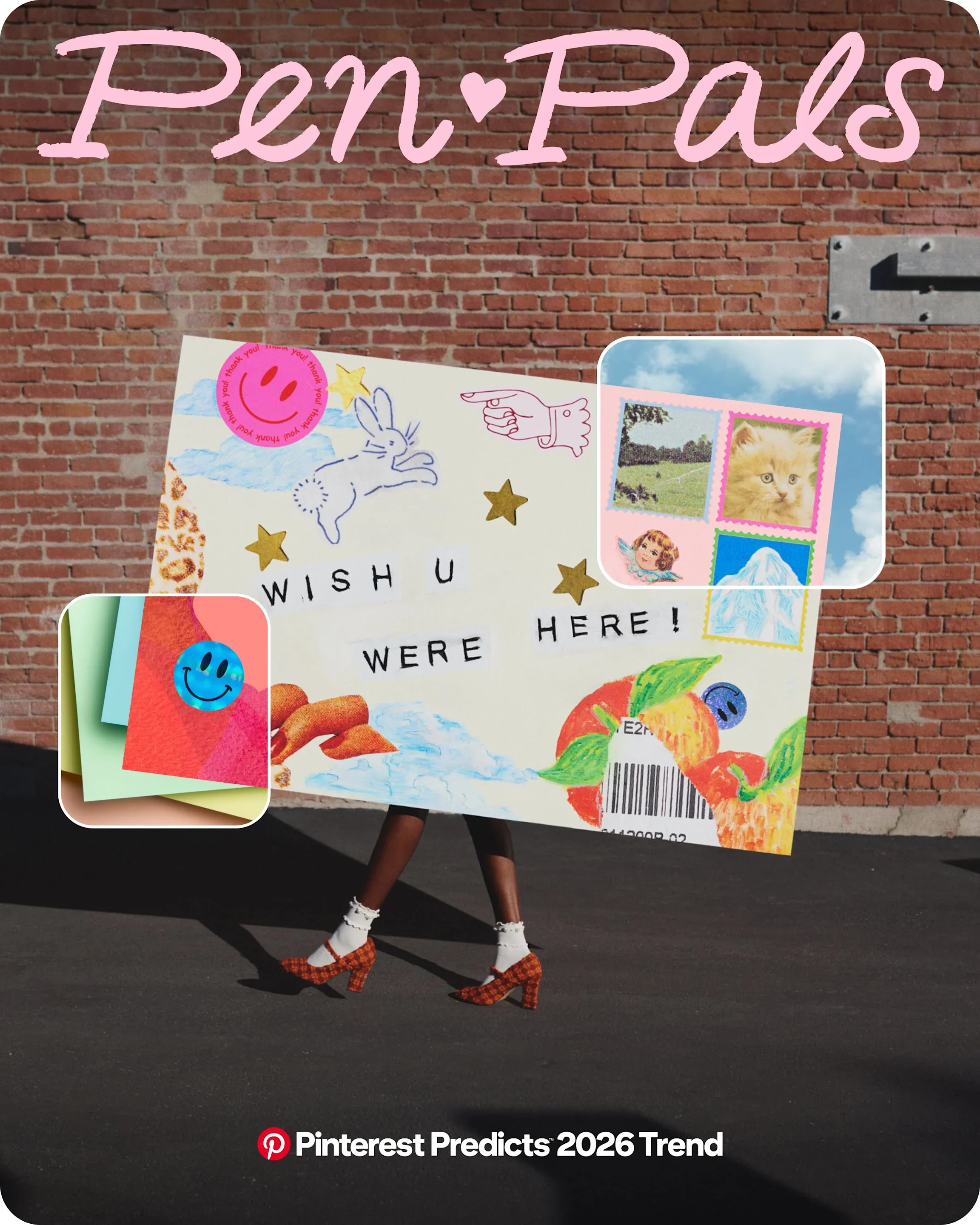
Pen Pals
Slow connection and analogue joy
Handwriting, letters and intentional communication make a return.
Theme and style:
Nostalgic, thoughtful, intimate
Colour feel:
Creams, soft browns, ink blue, muted tones
How this could show up in what you offer:
– Stationery brands expanding into letter writing kits
– Gift businesses creating slow living bundles
– Educators and creatives offering reflective, offline experiences
– Brands encouraging connection beyond screens
Khaki Coded
Utility with style
Functional, grounded and inspired by nature and exploration.
Theme and style:
Practical, minimal, outdoorsy
Colour feel:
Khaki, sand, olive, muted greens
How this could show up in what you offer:
– Fashion brands focusing on practical, timeless pieces
– Outdoor or lifestyle products designed for real life
– Interiors inspired by calm, neutral landscapes
– Brands leaning into durability and purpose
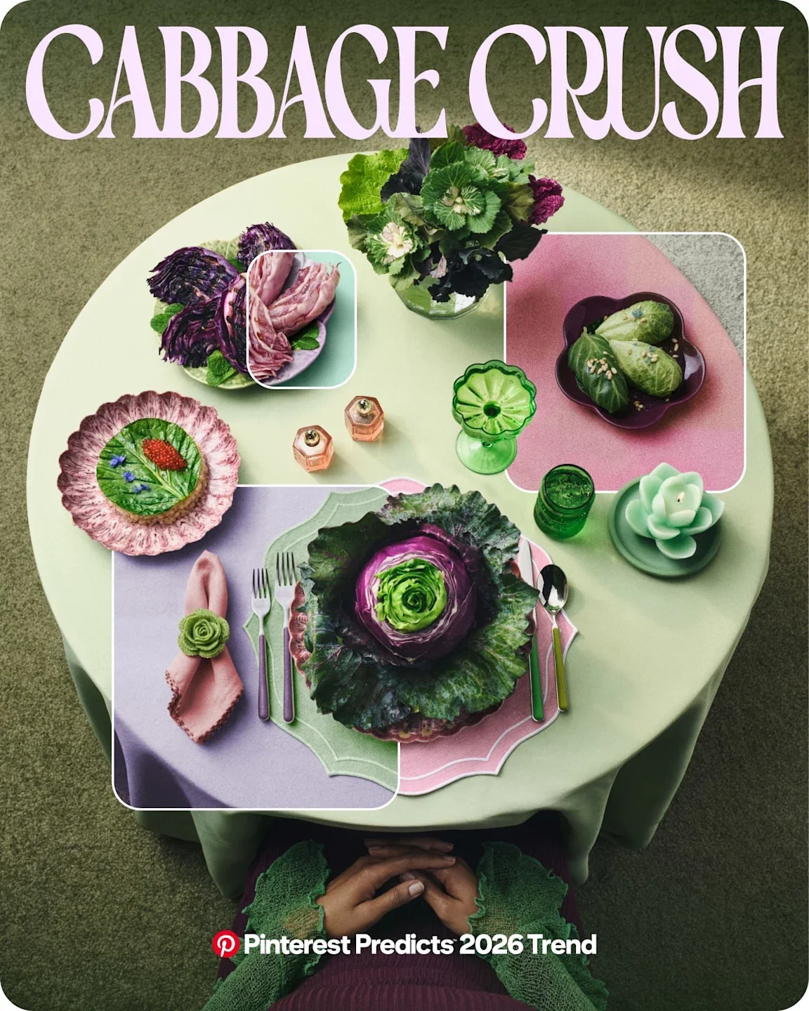
Cabbage Crush
Comfort food with creativity
Yes, cabbage. Humble ingredients getting elevated and celebrated.
Theme and style:
Wholesome, earthy, nourishing
Colour feel:
Greens, creams, natural food tones
How this could show up in what you offer:
– Food businesses creating veg forward menus or products
– Wellness brands leaning into gut health and nourishment
– Recipe creators focusing on simple, comforting cooking
– Hospitality businesses highlighting seasonal, honest food
Neo Deco
Old glamour, new edge
Art Deco shapes with a modern twist.
Theme and style:
Structured, elegant, bold
Colour feel:
Black, gold, emerald, rich neutrals
How this could show up in what you offer:
– Home décor with geometric details
– Jewellery or accessories inspired by Deco shapes
– Branding and packaging with strong structure
– Businesses wanting to feel polished and premium
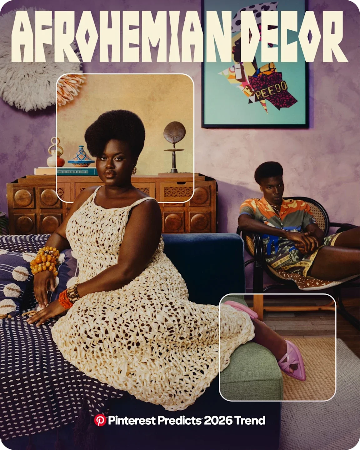
Afrohemian Decor
Culture, craft and warmth
A blend of African influences with bohemian ease.
Theme and style:
Layered, soulful, artisanal
Colour feel:
Warm earth tones, rust, ochre, deep browns
How this could show up in what you offer:
– Interior designers using textured materials and handmade pieces
– Homeware brands celebrating craft and heritage
– Textile makers focusing on pattern and story
– Brands leaning into slow, intentional design
Laced Up
Delicate detail, unexpected places
Lace moves beyond lingerie into beauty, accessories and styling.
Theme and style:
Romantic, detailed, expressive
Colour feel:
Soft neutrals, black, muted pastels
How this could show up in what you offer:
– Fashion and accessories using lace in new ways
– Beauty brands incorporating lace inspired detail
– Packaging and presentation with delicate textures
– Brands celebrating softness as strength
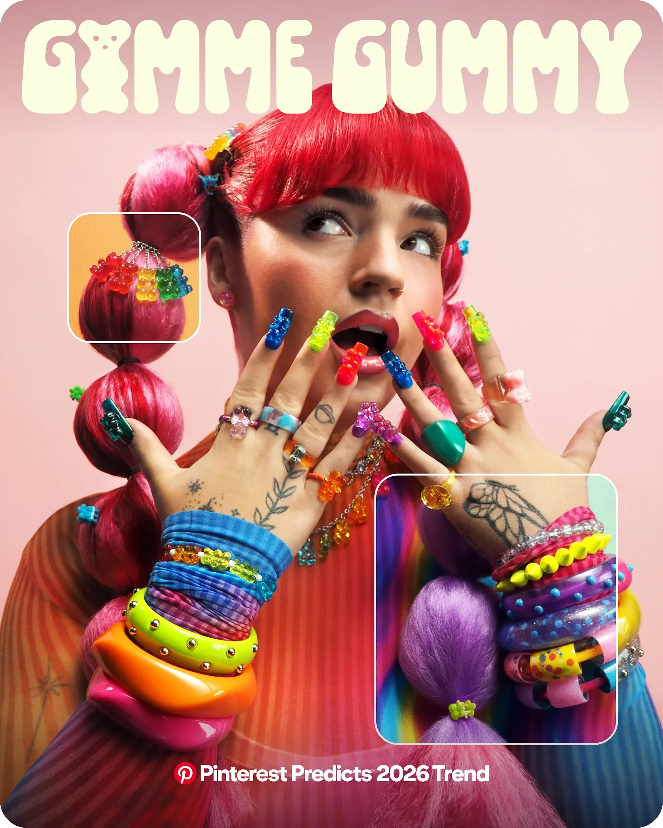
Gimme Gummy
Playful, glossy, joy-first design
Gimme Gummy is bright, tactile and a little bit nostalgic. Think sweet-shop colours, jelly textures and things that look good enough to bite. It’s playful without being childish and bold without being chaotic.
Theme and style:
Fun, squishy, joyful, sensory led
Colour feel:
Bubblegum pink, cherry red, citrus orange, lime green, glossy finishes
How this could show up in what you offer:
– Product based businesses using high shine finishes or translucent materials
– Beauty and wellness brands leaning into fruity colours and playful packaging
– Homeware makers creating sculptural, rounded pieces with a glossy feel
– Kids or family focused brands embracing colour without apology
– Service providers using brighter palettes and more expressive visuals to feel approachable and fun
Scent Stacking
Personal fragrance, layered meaning
People want to customise how they smell, not buy one signature scent.
Theme and style:
Sensory, personal, bespoke
Colour feel:
Depends on scent families but often soft, warm, layered
How this could show up in what you offer:
– Fragrance brands creating mix and match products
– Wellness businesses exploring scent rituals
– Gift brands offering personalised scent experiences
– Makers focusing on mood based fragrance
Make it stand out
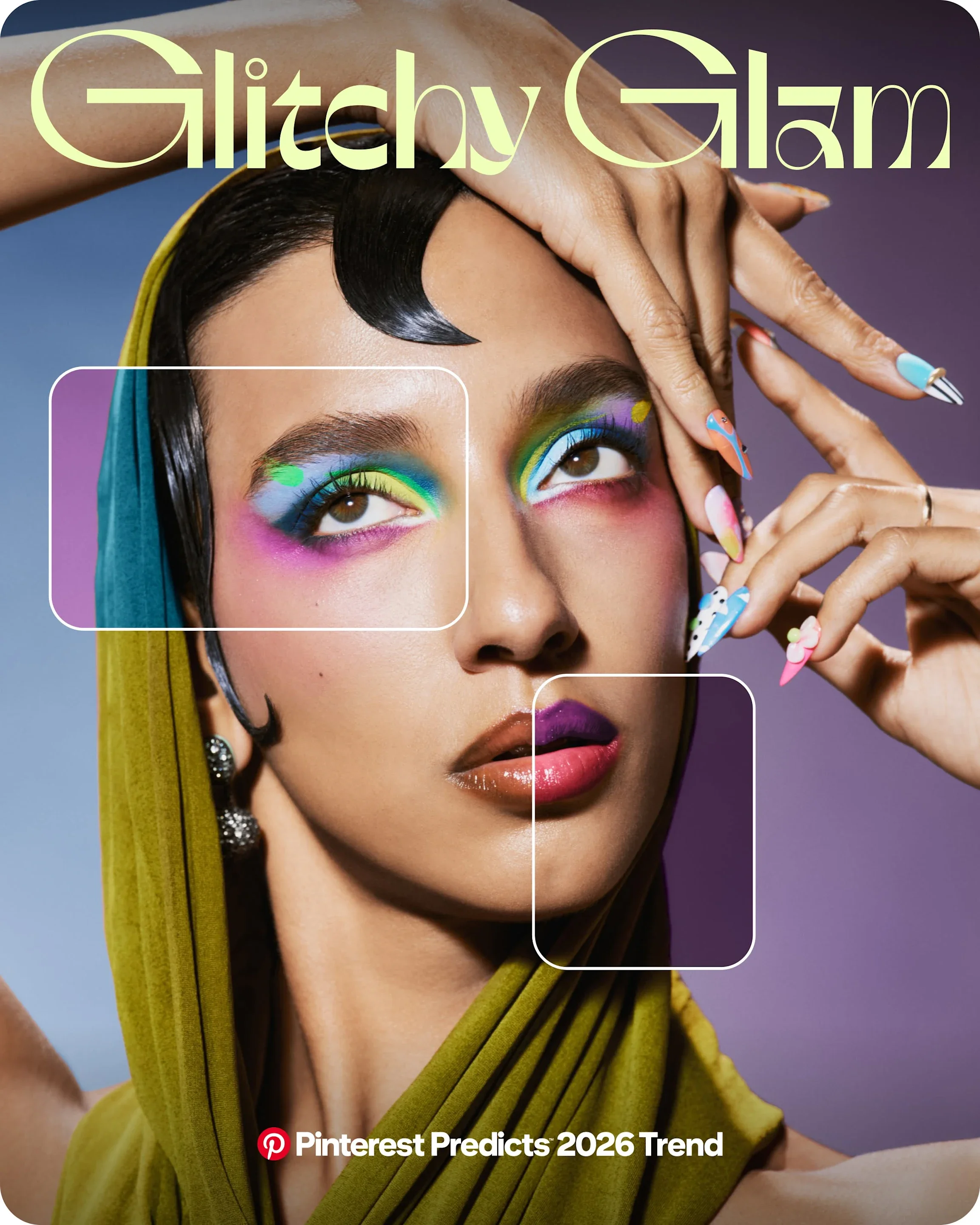
Glitchy Glam
Polished meets imperfect
Glitchy Glam blends sleek, high gloss aesthetics with digital distortion and intentional imperfections. It’s shiny, futuristic and slightly off kilter in the best way.
Theme and style:
Futuristic, edgy, digital, high contrast
Colour feel:
Chrome, black, neon accents, electric blues and pinks
How this could show up in what you offer:
– Fashion brands playing with metallics, cut outs or unexpected details
– Beauty brands using reflective packaging or bold, high contrast colour stories
– Designers mixing clean layouts with distorted or layered elements
– Photographers or creatives experimenting with light, blur or digital effects
– Tech or online service businesses leaning into a more experimental, modern look
Vamp Romantic
Dark romance and emotional depth
Moody, gothic inspired aesthetics with softness and elegance.
Theme and style:
Romantic, dramatic, expressive
Colour feel:
Deep red, black, plum, smoky tones
How this could show up in what you offer:
– Fashion embracing rich fabrics and silhouettes
– Beauty brands leaning into dramatic colour stories
– Home décor using moody lighting and texture
– Creative brands exploring emotion and depth
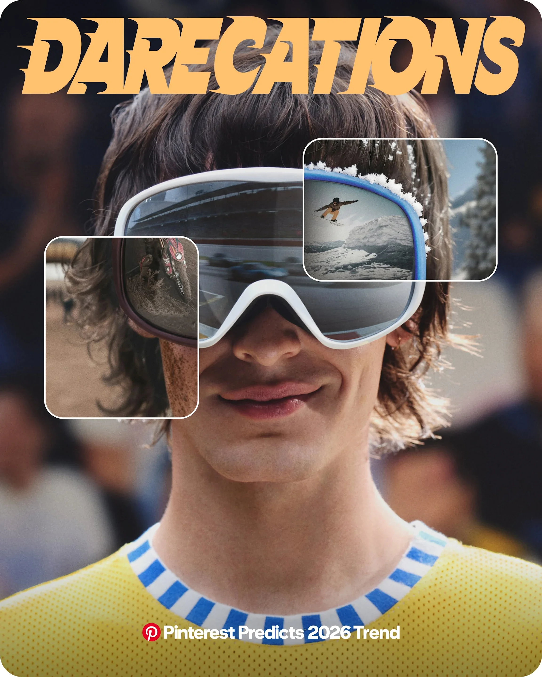
Darecations
Rest, retreat and quiet escapism
Darcations are about slowing down and seeking comfort in darker, moodier environments. Less bright sunshine, more cosy corners, candlelight and deep colours.
Theme and style:
Restful, cocooning, intimate, grounding
Colour feel:
Charcoal, deep brown, forest green, midnight blue
How this could show up in what you offer:
– Interior brands creating cosy, low light spaces and darker palettes
– Hospitality businesses leaning into snug, intimate atmospheres
– Wellness brands focusing on rest, sleep and nervous system regulation
– Makers offering products designed for evenings rather than mornings
– Service providers positioning their work as supportive, steady and calming
Wilderkind
Nature, innocence and curiosity
A gentle return to nature with a playful, childlike lens.
Theme and style:
Whimsical, organic, gentle
Colour feel:
Soft greens, browns, natural tones
How this could show up in what you offer:
– Children’s products inspired by animals and forests
– Nature led wellness offerings
– Handmade products using natural materials
– Brands celebrating curiosity and wonder
Mystic Outlands
Wild landscapes and spiritual escape
Remote, mystical places and untamed beauty.
Theme and style:
Expansive, mysterious, grounding
Colour feel:
Stormy blues, charcoal, earthy neutrals
How this could show up in what you offer:
– Retreats and experiences rooted in nature
– Art and photography inspired by wild landscapes
– Interiors using raw textures and moody palettes
– Brands offering escape from everyday noise
Pinterest Predicts isn’t about chasing trends. It’s about noticing where curiosity is heading and deciding what that means for your work.
You don’t need to adopt everything. You just need to stay open.
Because the businesses that thrive are the ones willing to explore, experiment and most of all, enjoy the process.
Ready to grow your Pinterest account the right way? Whether you need help developing your strategy, understanding keywords or simply finding a rhythm you can sustain, I’ll help you turn your Pinterest into a marketing tool that keeps working for you. Book in for a free discovery call and let’s look at how we can take your Pinterest from meh to amazing.
And if you’d like regular tips, ideas and encouragement straight to your inbox, make sure you’re signed up for my newsletter. It’s full of practical advice to help you show up on social media without the overwhelm.